Client:
Vantage Analytics, UK
Date:
August 2024
Duration:
One Month
Cost:
- -
How and what
we did

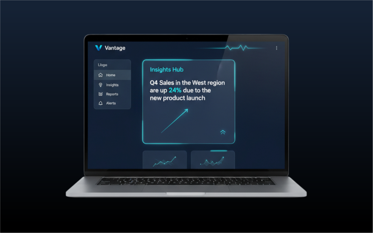
Vantage had a powerful analytics platform, but user feedback indicated the dashboard was overwhelming and key insights were hard to find, leading to low user adoption.
1. Heuristic Evaluation & Competitor Analysis:
We started by auditing the existing dashboard against UX principles and analyzing competitor dashboards. We identified issues with information hierarchy, cluttered layouts, and a lack of data visualization best practices.
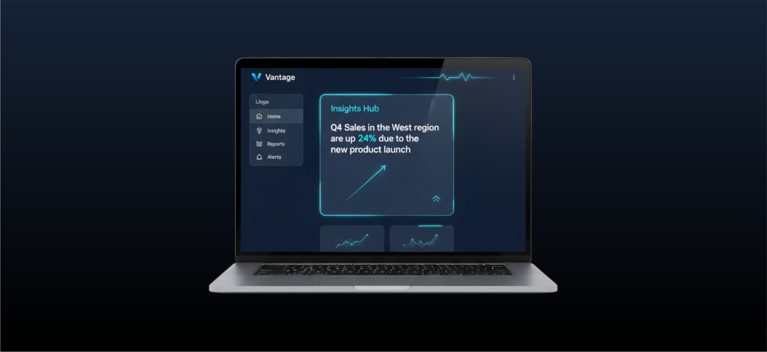
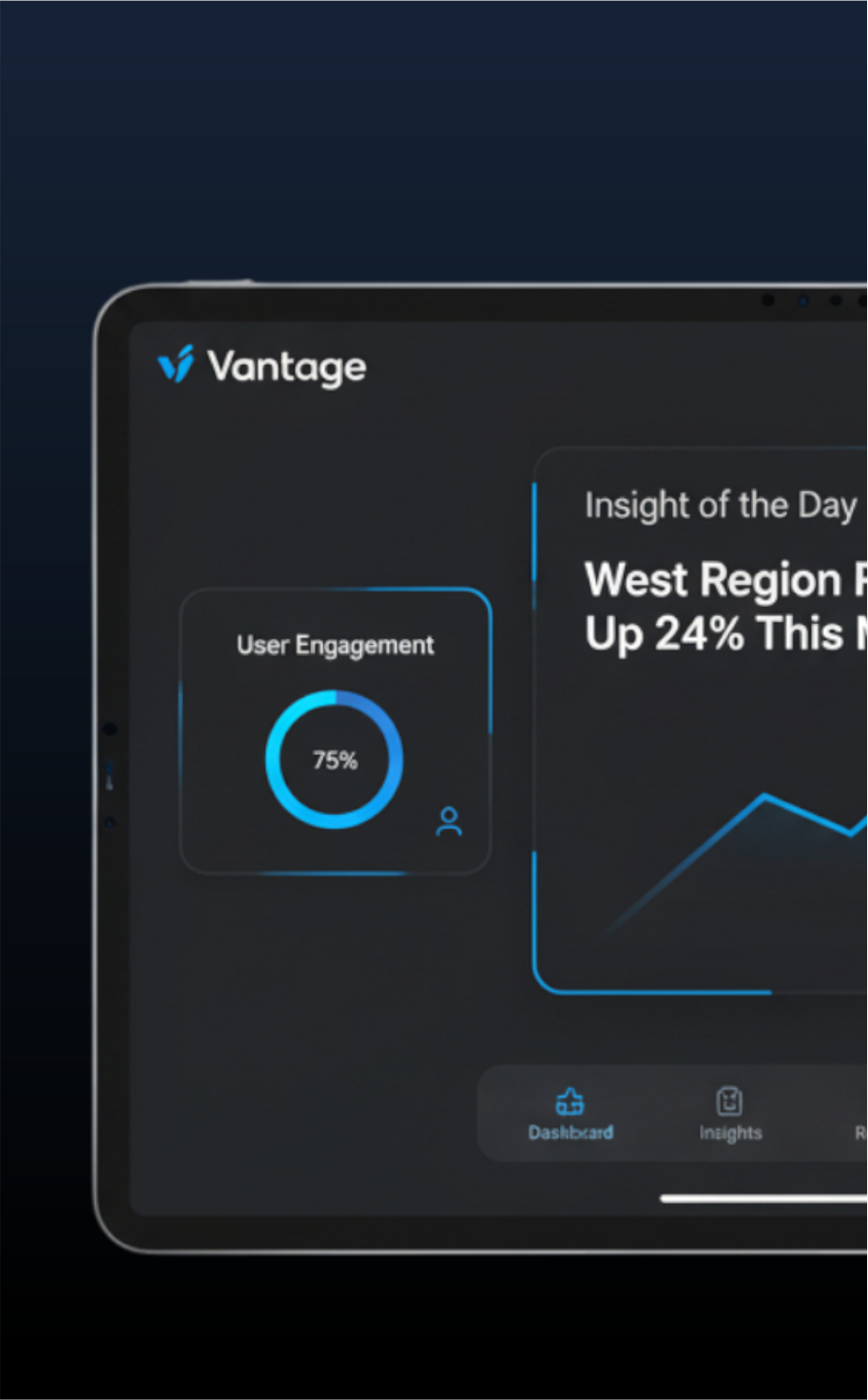
2. Data Visualization & Interaction Design:
We redesigned the dashboard to focus on storytelling. We introduced customizable widgets, interactive charts, and a clear "key metrics at a glance" section. The new UI used a more professional color scheme tailored for data clarity.
3. Impact:
The redesigned dashboard led to a 40% decrease in user-reported confusion and a significant increase in daily active users. Clients could now derive insights faster, increasing the platform's perceived value.